Sunday, July 24, 2011

Backsplash Bold?

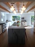
I've been having a dilemma over our kitchen backsplash for over 2 months now and I'm here to admit that I still haven't decided on anything for sure.  Incase you forgot, this is what my kitchen currently looks like .... It's very white, clean and airy ... which is not necessarily bad, but I do want to add a little more interest and pattern to the mix.  Recently we added some grey stripes to our breakfast nook and will eventually be adding either brown or black bench seating around the window.  We sort of decided on our hood and will probably going with this viking range hood.

Now the last major thing left and probably the biggest statement piece in our kitchen is the backsplash!

I originally wanted to go with all Calcutta marble so that the counters would continue into the backsplash like these inspiration pics.  I love that the marble is both very graphic and calming at the same time, but it just seemed a little too overdone for our kitchen and would probably end up more expensive than planned.


The second option that I really considered was a herringbone pattern ... something that always makes me happy when I see it in design!  I was especially inspired by these images from deco pad that look very sophisticated and well traveled.


While browsing at many tile stores, I have seen various versions of the herringbone pattern, but nothing exactly like this.  The color and beautiful texture is exactly what was missing from my kitchen.  So on a late Saturday afternoon, hours and hours into my quest to find the perfect herringbone, I found long limestone strips that are usually used for exteriors and decided to buy a 1 sq ft sample.


I knew it would be loooooooooong and agonizing process to create a herringbone pattern with these tiles, but I was willing to do whatever it took to get the look that I was going for.  After all the trouble it took to temporarily tape these suckers to my kitchen wall, I think I am a little over them.  They are very textured, maybe a little more than I'd like, and just seem way too rustic for my kitchen.  Maybe I am wrong ... I am open to suggestions.

Currently the tile that I am stuck on is a very patterned and bold trellis pattern.


I know that the trellis pattern is very overdone in the blogging community and may just become a trend that will be over in a few years.  To me however, it seems like a classic, beautifully symmetric lines that will never go out of style.


Mission Stone Tile
Personally, I have never seen the trellis pattern in a REAL home, so I think it will definitely be the wow factor in my kitchen and will hopefully make me smile every time I walk by.  I still haven't decided whether I prefer the cream and white or the brown and white for my kitchen.  I know that my hubby likes the toned down cream version, which if we go with, I will probably have to pair with a dark maybe faux wood wallpaper in the open cabinetry to add a little contrast.  The brown will add a ton of contrast and extra interest to our kitchen, but I don't know if it will be soo much that I will get tired of it in a few years.  Please help, any suggestions welcome!

Friday, July 1, 2011

Cabana Summer


We've been having beautiful weather for the past few days ... making me wish that summer lasted forever!  I'm especially enjoying the extra sunshine in our secret garden-esque backyard - which seems like it was perfectly designed for those long lazy summer days!  From our sparkling pool to the serene atmosphere of lush bushes and trees ... it's almost perfect expect for the small eye sore of a spot around the corner of the left side of our house.

Our house came with quite a surprise - a built-in wooden pergola with an above ground spa jacuzzi hidden inside ... what's wrong with that you may say ... I guess not much other than a probably disease infected 15 year old jacuzzi and a rotting deck underneath ... Once removed, it's actually the perfect spot for my dream cabana oasis!


All of our resources are 100% dedicated to the interior of our home ... so for now a little dreaming will have to go a long way ....

Can you think of a more perfect way to spend a summer afternoon than taking a mid-day nap underneath a whimsical canopy? ... did I mention warm fuzzy kittens included?

What could be more fun that having brunch or some afternoon drinks with your favorite people in this ultra sexy coral oasis!


Although these rainbow cabanas are breath taking ... I think I would prefer the simple sophistication of white and black for my own backyard!


In particular, I've had my eye on this bold black & white stripped beauty from ZGallerie -although the pattern is very in your face ... it's still very classic and would go well with any color palette.