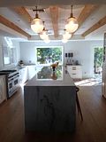
Now the last major thing left and probably the biggest statement piece in our kitchen is the backsplash!
I originally wanted to go with all Calcutta marble so that the counters would continue into the backsplash like these inspiration pics. I love that the marble is both very graphic and calming at the same time, but it just seemed a little too overdone for our kitchen and would probably end up more expensive than planned.
The second option that I really considered was a herringbone pattern ... something that always makes me happy when I see it in design! I was especially inspired by these images from deco pad that look very sophisticated and well traveled.
While browsing at many tile stores, I have seen various versions of the herringbone pattern, but nothing exactly like this. The color and beautiful texture is exactly what was missing from my kitchen. So on a late Saturday afternoon, hours and hours into my quest to find the perfect herringbone, I found long limestone strips that are usually used for exteriors and decided to buy a 1 sq ft sample.
I knew it would be loooooooooong and agonizing process to create a herringbone pattern with these tiles, but I was willing to do whatever it took to get the look that I was going for. After all the trouble it took to temporarily tape these suckers to my kitchen wall, I think I am a little over them. They are very textured, maybe a little more than I'd like, and just seem way too rustic for my kitchen. Maybe I am wrong ... I am open to suggestions.
Currently the tile that I am stuck on is a very patterned and bold trellis pattern.
I know that the trellis pattern is very overdone in the blogging community and may just become a trend that will be over in a few years. To me however, it seems like a classic, beautifully symmetric lines that will never go out of style.
 |
| Mission Stone Tile |


.JPG)


Love the herring bone! So beautiful! go for it!!!
ReplyDeleteHi Alena, I am a huge fan of herringbone and trellis so you get my full support. I know that trellis marble, have a big sample of of it in beige and white and its gorgeous! Ditto for the herringbone, you cannot go wrong..all beautiful choices that will add interest to the room. Your kitchen looks gorgeous!
ReplyDeletei love both ideas--will seriously look so insane fabulous~ and add such an interesting focal point! i cannot wait to see it~ you have fantastic style
ReplyDeleteI love the herring bone!! So so cute. I swoon over your GORGEOUS kitchen!! So jealous. I love white kitchens.. Maybe one day:) can't wait to see pics...
ReplyDelete